Adios Cassini

A couple of months ago, 15 September to be precise, marked the end of an era in the human exploration of our solar system. The Cassini spacecraft was programmed to crash into Saturn’s upper atmosphere and burn up, thus ending an almost two-decade journey and exploration of Saturn and its moons. I was in middle school when this mission launched in 1997, and at that point, even reaching Saturn in 2004 seemed eons away. Twenty years later, perhaps it’s time to look back at some of the amazing insights we’ve gained.

Cassini is actually a shortened name for the Cassini-Huygens mission, and comprises the main spacecraft — Cassini — designed to travel as a satellite in the Saturn planetary system, and a small lander — Huygens — designed to actually land on Titan, Saturn’s largest moon.

Giovanni Cassini was an Italian mathematician and astronomer, and discovered four of Saturn’s moons — Iapetus, Rhea, Tethys and Dione. The Cassini spacecraft was the first to observe all four of these moons. Christiaan Huygens was, of course, a famous Dutch astronomer and scientist, and discovered — but of course — Titan, then the first known moon of Saturn. (He also invented the pendulum clock, was mentor to Gottfried Leibniz, studied optics and the wave nature of light, and derived the modern formula for centripetal force.)

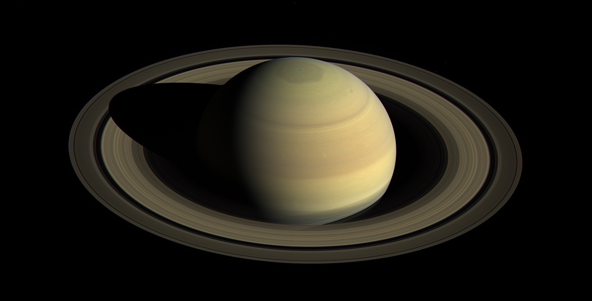
Saturn by Cassini

Saturn by Cassini (via Wikipedia).

Of the many discoveries made by Cassini, I’ll focus on just two stories: those of Saturn’s largest moon Titan, and Saturn’s hexagon. Both of these fascinate me to no end, and I think reflect the best of Cassini’s contributions.

Saturn's Polar Hexagon

Jupiter is famous for its Great Red Spot; Saturn has its own atmospheric phenomenon that’s equally fascinating. Saturn’s Hexagon was first discovered by the Voyager missions, but now Cassini has had the chance to see it from up close.

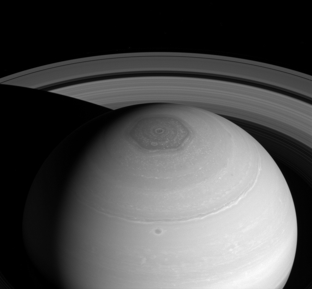
Technically, the Hexagon is a persisting cloud pattern formed by jet streams around Saturn’s north pole, but its sheer size and perfect symmetry make it unique. Each side of the hexagon is about 13800km long (to compare, Earth’s diameter is about 12700km), and its winds travel at around 300km/h. It’s been there since the Voyager missions in the 1980s, so we know its long-lived.

Saturn - North polar hexagon and vortex as well as rings (April 2, 2014)

Saturn - North polar hexagon and vortex as well as rings (April 2, 2014) (via Wikipedia).

On Earth, our jet streams are forced to bend and move in response to Earth’s surface features such as mountains. Saturn is much larger than Earth (Saturn diameter is about 116000km) but has a rocky core that’s similar in size to Earth, and so its jet streams have no such problems, and can keep flowing in their own orderly and symmetrical fashion.

The hexagon is essentially a quirk of fluid mechanics. Here on Earth, scientists have been able to create (here, and here) such regular shapes by rotating a circular tank of liquid at different speeds at its center and outer edge. Due to the difference in speeds, a turbulent region is created where such regular shapes can be observed. The regular shape is not always a hexagon (shapes with three to eight sides, i.e. from a triangle to an octagon, are produced) but a hexagon is the most commonly occurring. However, the phenomenon only occurs when the speed differential and fluid properties fall under certain small margins, and therefore the hexagon phenomenon is not observed everywhere where its possible (such as Jupiter, or even the south pole of Saturn).

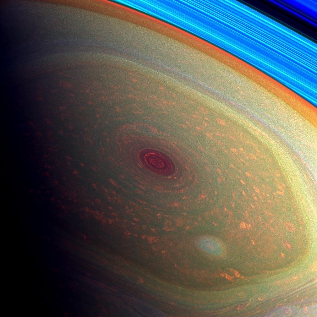
At the center of the Hexagon, right at the north pole, is a humongous storm, with a definite and easily observed eye wall. The south pole has such a storm as well, although it doesn’t display a Hexagon. In each case, the eye of the storm is about 50 times wider than a hurricane would be on Earth.

As much as the Hexagon is an atmospheric and scientific phenomenon, explained and replicated under lab conditions, it’s one of our solar system’s most beautiful sights, and something I’ll keep looking for in photos of Saturn, now that I know it’s there.

False color image of storms at Saturn's north pole

False color image of storms at Saturn’s north pole (via JPL/NASA).

Titan

Titan is Saturn’s largest moon, and of special interest to us: Titan is the only known moon with an atmosphere, and the only one other than Earth whose atmosphere is majority nitrogen. Moreover, its atmosphere is denser and more massive than ours, and is opaque at many wavelengths of light. This means that, like Venus, we had no idea of what the surface of Titan looks like until we had a probe that could land on the surface of Titan. Thanks to Cassini and Huygens, we know a lot more today about Titan than we did in 2004.

Titan, we know now, has an active weather system, including wind and liquid rain, just like on Earth. Of course, the liquid that rains is different from Earth: it rains liquid methane on Titan. Nevertheless, its nitrogen atmosphere and presence of liquids means that Titan’s methane cycle is analogous to Earth’s water cycle. Titan’s upper atmosphere is also affected by ultraviolet light from the Sun, whereby atmospheric methane is broken down and reconstituted into a diverse mix of complex hydrocarbons.

We’re not done yet with the comparisons with Earth! Titan has lakes and oceans, comprised of methane, ethane, and dissolved nitrogen; this makes Titan only the second object in the Solar System (after Earth) to have stable liquids present at ambient temperatures. It most likely also has volcanoes, and is affected by tidal effects from Saturn’s massive gravity. Titan’s surface, specifically where Huygens landed, looks uncannily like Earth, with ‘globules’ about 10-15cm in size, made probably of water ice.

Huygens' view of Titan's surface

Huygens’ view of Titan’s surface (via Wikipedia).

It’s almost as if Titan is an analogue of Earth— only much colder. In fact, in very specific ways it’s not even colder by much thanks to Titan’s greenhouse effect and tidal heating from Saturn. Cassini has performed numerous gravity measurements of Titan, which reveal that there is a hidden, internal, ocean of liquid water and ammonia beneath Titan’s surface.

So, to summarize, Titan has: an active weather system, large quantities of complex hydrocarbons (Titan is much, much richer in hydrocarbons than Earth), tidal effects from Saturn, and interaction of its atmospheric methane with ultraviolet radiation from the Sun, and even and underground ocean of liquid water and ammonia. A question is begging to be asked at this point: what are the chances of life (past, present or future) on Titan?

Scientists think Titan definitely has the potential to contain habitable environments. Similar to Earth in its infancy, Titan today has the pieces needed for new life to possibly form. Whether it already has, or the extent of future possibility, can only be understood with even better exploration. Indeed, quite a few ideas for future missions dedicated to Titan have been proposed, but none have really gotten off the ground (pun intended) yet.

The most promising of them all is a design to send a submarine to Titan that can explore the seas of Titan, but even this idea is in relatively early stages.

So Much More...

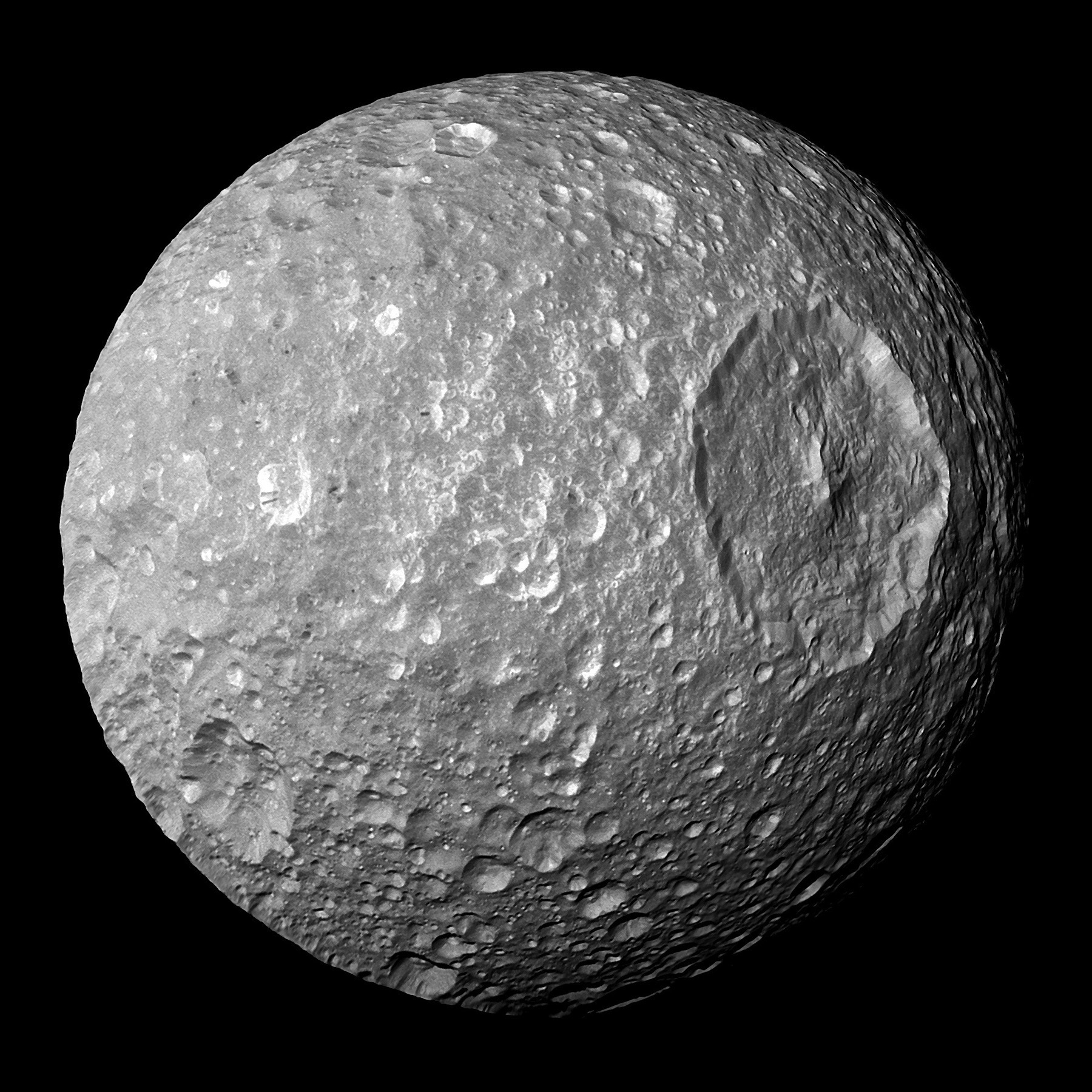
I’ve really just scratched the surface here of how much the Cassini mission gleaned from the Saturn system. There’s so much more: Saturn’s rings and their composition; the moon Enceladus and its jets of icy particles and subsurface ocean of salty water; the moon Iapetus and its equatorial ridge; the moon Mimas and its crater that gives it the Death Star look… trust me, if you don’t take an interest yet, you will once you start reading.

The Cassini-Huygens mission really gave us glimpses into a planetary system that provides great opportunities for scientific discovery, amazing new and diverse worlds, and even — dare we dream? — possibilities of places that can harbor life.

It’s time to say adios to Cassini, but of course, we humans have a long way to go before we can say we know our own solar system.

Saturn's moon Mimas, with the crater Herschel visible prominently

Saturn’s moon Mimas, with the crater Herschel visible prominently (via Wikipedia).

(This piece first appeared in the 2017 edition of Sharod Sombhar, an annual magazine from the Bengali Students’ Association at Virginia Tech.)


Of India’s high-speed rail ambitions, and lazy Indian journalism

India’s plans about building a high speed rail route connecting Mumbai and Ahmedabad have been in the news lately. The project is funded by a low-interest loan from Japan (covering 80% of the cost of the project), and will make use of Japanese high-speed rail technology used for the Shinkansen.

Of course, along with the project being in the news, it is also subject to critique in news articles, as any expensive government venture is bound to (and should!) be. In many of the articles, though, I found one common piece of information mentioned over and over:

According to a study conducted by IIM Ahmedabad, Ahmedabad-Mumbai bullet train will need to make 100 trips daily and carry 88,000-118,000 passengers per day to be financially viable. This figure could well be way above the total number of passengers travelling between the two cities on any given day.

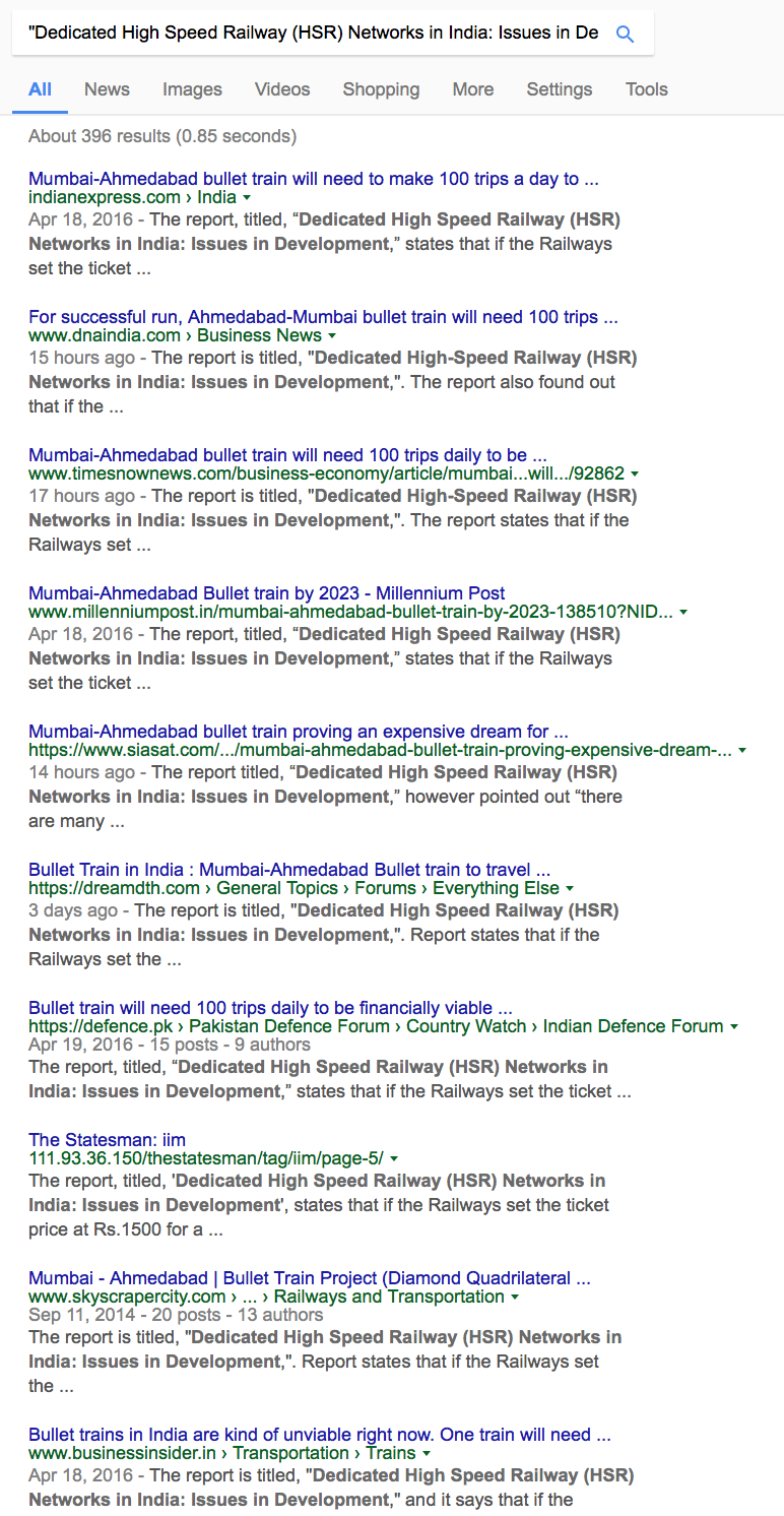
In fact, searching the internet with the name of the article in question (Dedicated High Speed Railway (HSR) Networks in India: Issues in Development) provides a result that looks like this:

Google Search Result

Google Search Result. (Source)

They all mention the same report, and all mention the exact same language about “requiring 100 trips a day”. None, however, actually provide links for the curious reader, nor provide any context or analysis. Well, I was curious, so I tried to find and read the actual report.

This is the the report I found online. It’s co-authored by Prof. G. Raghuram as mentioned in all the newspaper reports, and calls itself “an abridged version of an IIMA working paper with the same title.” Unfortunately, the IIMA working paper link is broken, and the Wayback Machine doesn’t have it archived either. (P.S.: Between the time that I found and read the report, and I finished writing this piece, the webpage hosting the report seems to have gone dead. No matter, the Wayback Machine has it cached. Go read!)

Anyhow, the report is a great read. After reading it, though, I was reminded of how poor India’s average journalism has come to be. What every news article printed is actually in the report being cited, and yet — and yet! — what they printed is a complete misrepresentation of the entire point and view of the report.

Let’s start with the conclusions of the report. The following are direct quotes from the Conclusions section:

  • Given that India is a developing country, the primary concern is whether the funds for such a project could be better utilised in other domains, including in upgrading conventional rail. However, the Japanese funding to the tune of 80% of the project cost may not be available for other uses.
  • there are many positive benefits and externalities of the HSR which would be useful in India’s overall aspirational development. These externalities include technology percolation into other domains, economic development, game-changing sense of connectivity, and national pride due to cutting-edge infrastructure. In such a context, it is a good idea to begin and learn.
  • The Mumbai-Ahmedabad route is a good choice for the first route, since it connects India’s first and seventh most populous cities, with significant economic development in the 500 km corridor between them.
  • The low cost Japanese financing has been a great catalyst. Though it is a tied funding with significant mandatory procurement from Japan, it cannot do much harm since Japan is at the cutting edge of HSR technology with over 50 years of experience.

Evidently, the overarching view of the article is not that “100 trips will be needed per day…”. Let’s talk about that part next, then. Here’s the crucial paragraph from the article:

Assuming that 20% (apart from the 80% Japanese funding at concessional rates) of the total cost of the Mumbai-Ahmedabad route would be funded by the Government of India (GoI) with an expected 8% annual return during the operational phase, the estimated daily financing costs for the route would be INR 106 million from when the repayment of the loan kicks in. We take this to be the 16th year (till when the Japanese loan has a moratorium), by when the ramp-up of traffic should have occurred. The project cost includes the ‘interest during construction’ for seven years. Over the remaining eight ramp-up years, we assume that there would be enough operating surplus to cover the interest payments. Subsequent to this, the GoI portion is treated as an equity with only interest due, but no principal repayment. Taking an average fare of INR 5.00 per km for the route with intermediate stops and for a scenario of 0.4 operating ratio, we arrive at a daily required ridership of 118,000 passengers (which translates to 43 million passengers annually). At an average of 1000 passengers per train, over 100 services per day (50 per direction) would be required.

What this means is that if the financing for the rail route is to be paid from the revenue from the rail route only, then about 118000 passengers, at an average of 1000 per train, over 100 services daily, would need to travel on the route. The newspaper articles only mention the raw number, with a vague notion that this is impractical or impossible to achieve. Two points should be considered, though. First, perhaps it isn’t necessary that revenue from the rail route matches the required financing. Perhaps the government can pay for the financing in the short term, and accrue revenue from the rail route to replenish its coffers in the longer term. Second, what is the context for the “1000 per train, 100 services daily” figure? How does it compare to other high speed rail systems in other countries?

Considering the second point first, here is literally the very next paragraph in the report:

The feasibility report estimates for 2033 with a train configuration of 10/16 cars (750/1200 seats) require 52 trains per day per direction. As of 2016, some of the high-traffic HSR routes like Paris-Lyon (409 km), Shanghai-Nanjing (311 km) and Tokyo-Shin Osaka (552 km), though being parts of bigger networks themselves, have more than 85, 300 and 330 trains respectively running every day.

Well, then! In context, the “100 trains per day” number doesn’t look so bad, does it? Considering this information, perhaps the first point above regarding financing isn’t that big a concern, either? It would seem so from the report, since it makes no further comment regarding this matter, including in its conclusions.

There are other points that the news articles mention, such as the 500km distance of the route, as being detrimental to the success of the project (“Flights only take one hour!”). Even those points are considered and answered in the report. The report really is worth the read.

The pros and cons of a large, time-consuming, and expensive government project should be debated — ernestly. However, the debate is derailed (forgive the pun) right at the beginning if the information being circulated is incomplete, or worse, plain wrong. Please, by all means, have the debate. Would everyone at least read the report that everyone is attempting to cite?

P.S.: Between the time that I found and read the report, and I finished writing this piece, the webpage hosting the report seems to have gone dead. No matter, the Wayback Machine has it cached. Go read!


Of Alien Megastructures

They call it Tabby’s star. It is a main sequence star quite similar to our Sun, and is about 1500 light years away from us, in the region of the constellation Cygnus. And it’s a particularly odd one. It was studied using the Kepler Space Observatory, which is the space telescope used for identifying planets orbiting distant stars. All of the exoplanet discoveries in the news over the past few years is due to Kepler.

To understand what’s odd about Tabby’s star, we need to know how Kepler operates. What it does is measure — very accurately — the apparent brightness of stars over time. If the apparent brightness of a star changes, that data is used to find patterns in how much and when the brightness changes occur.

Consider what happens with a planet revolving around a star. The apparent brightness of the star dips every time the planet passes in front — i.e. to observers here on Earth — of the star, and the amount and duration of the dip correlates with the size and velocity of the planet. This process works well, and has helped in the discovery of many, many exoplanets revolving around numerous star systems.

Now that we know the basics, here’s why Tabby’s star is so intriguing. Tabby’s star shows small dips in brightness that are both frequent and non-periodic. It has also shown two large recorded dips separated by two years time. How large are the large dips? Where a Jupiter sized planet would have obstructed the star by about 1%, the large dips obscure the star by as much as 15% to 22%. Whatever is blocking the star light during the major dips is not a planet — it is obscuring almost half the width of the star.

That’s not all. It turns out, even without the obscuring, the light output from Tabby’s star seems to be diminishing over time. It turns out, we have observational data about this star since 1890 (via numerous photographs that contain this star in the image), and it seems to have faded by 20% from 1890 to 1989! Even if such old and long-term data is deemed inaccurate, Tabby’s star has definitely diminished in the recent past, in the era of modern measurements. It seems to dim at a slow steady rate, with one short period of a more dramatic fading.

What could be causing such behavior? A number of hypotheses have been proposed, but none of them fully explain the observations. Could it be a young star with coalescing planetary material floating around it? Nope; no such evidence found. Could there be debris from planets that have collided and created clouds of debris and dust? Nope; this is not supported by observations. Could it be a huge number of disintegrating comets orbiting the star? Nope: they wouldn’t obscure the star’s luminosity by as much as 22%.

Well, could it be aliens?

We on Earth are starting to realize how important it is to harness the Sun’s energy as much as we can. We as a civilization have already fantasized about the creation of a huge structure that captures solar energy from every direction, not just from Earth, and using that energy as our planetary energy needs soar. Such a structure is a sphere that “covers” the Sun, and is called a Dyson Sphere, after the scientist who wrote a paper about it in 1960.

Dyson speculated that such a structure would become inevitable as a civilization advances and its energy needs escalate. Realistically, of course, the “sphere” wouldn’t be an actual sphere (imagine how big the sphere would have to be, and how it would revolve around the Sun!), but a “swarm” of smaller objects revolving around the Sun, like satellites. Collectively, they would serve a similar purpose.

What if the observations of Tabby’s star are the tell-tale signs of an alien civilization building a Dyson Swarm? It would explain the long-term fading, and also the sharp dips in its brightness. It would not be a planet; it’d be an artificial mega-structure being slowly constructed. Such construction projects could very easily — by design — obscure 22% of the star’s luminosity.

It’s an idea, and it’s a pretty fantasy for earthlings in the infancy of space-flight, but this idea does have its caveat. An advanced civilization would most likely have a lot of radio signal emissions (we do too — our TV and radio signals are propagating into space at the speed of light) that we should be able to detect. The SETI (Search for Extra-Terrestrial Intelligence) project spent two weeks studying the star system in October 2015, but did not find any technology-related radio signals in multiple frequency spectra.

If you can’t contain your excitement about the possibility of alien life, you still have hope. Whatever the caveat, and however slim the chances, scientists have not been able to rule out this possibility. More studies are planned that will devote resources — including that of SETI — towards studying Tabby’s star and its surroundings, and we will know more in 2017. If they’re really an advanced alien civilization, for all we know, they might have decided (and have the capability) to stop their radio signals from propagating into deep space!

If you’re apprehensive about finding aliens capable of — and in need of! — harnessing all of its star’s energy, you still have hope. What are the chances? For all the advancements we have made in astronomy and the study of the heavens, we really do yet have a lot to learn. When we observe anomalous behavior through our telescopes, the anomaly is due to limitations in our technology or understanding. What are the chances that this is the one case where our knowledge is perfect and the observations are unnatural?

Either way, this is one star we are certain to keep in our sights. The next few years will tell us more — about how little we know about the stars, or about how we’re not alone in the universe.

Updates:

  • This recent paper confirms that Tabby’s Star has faded throughout the duration of it being observed by Kepler. Other stars were also observed at the same time, and none of them fade at such a drastic rate. (doi:10.3847/2041-8205/830/2/L39)
  • The “Breakthrough Listen” project, backed by Prof. Stephen Fleming Hawking (oops, bad typo!) and funded by $100 million, will be used to observe Tabby’s star.

(This piece first appeared in the 2016 edition of Sharod Sombhar, an annual magazine from the Bengali Students’ Association at Virginia Tech.)


Gallons per 100 Miles — The Calibration Chart

In the US, automobile fuel economy is usually measured in miles per gallon, mpg. This works, but there is a better metric, especially for comparison between values. Gallons per 100 miles is the way to go!

This is very well known, and even I’ve talked about this before. There are numerous online tools to do the conversion from mpg to gallons per 100 miles… but there don’t appear to be any simple conversion or calibration charts for it.

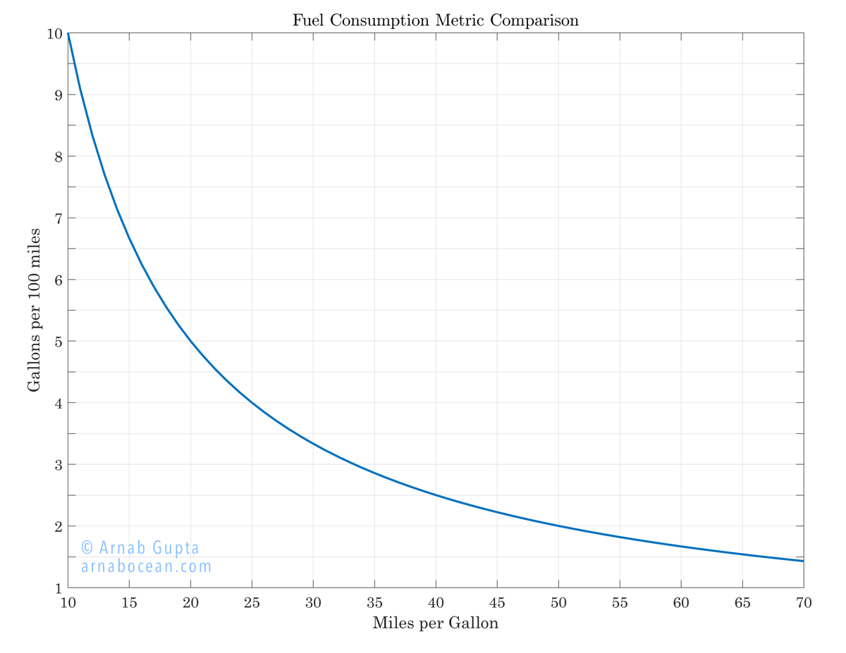
Well, here you are — an easy to use chart to convert between mpg and gallons per 100 miles (or, equivalently, from km/l to liters per 100km).

What’s wrong with using miles per gallon, though? Well, there’s nothing wrong with using it, of course (we all use it, after all!). It’s that it’s just not a good metric when it comes to comparisons.

This is because the mpg metric is not linear. This means that even a consistent difference in mpg, say a “10 mpg difference”, means different things based on where the difference is calculated from. This makes it very hard to calculate and compare the benefits of better fuel efficiency!

Let’s take a couple of examples and use the chart below. Let’s say you’re planning to shift from owning a 15mpg vehicle to owning a 25mpg vehicle. What are your fuel savings? On the other hand, say you’re shifting from a 25mpg vehicle to a 35mpg vehicle. What about now?

Gallons per 100 miles Conversion

Gallons per 100 miles Conversion (Download full size here)

Let’s look at the chart. The horizontal axis shows miles per gallon, as indicated. The vertical axis shows gallons per 100 miles, also as indicated. Let’s find approximate numbers for our cases above:

  • 15mpg → ≈ 6.7 gallons per 100 miles
  • 25mpg → 4 gallons per 100 miles
  • 35mpg → ≈ 2.8 gallons per 100 miles

For every 100 miles you drive, a “10mpg improvement” from 15mpg saves you 2.5 gallons (≈ 40%) of fuel. On the other hand, over the same 100 miles and the same “10mpg improvement”, but from 25mpg, you save only 1.2 gallons (≈ 30%) of fuel. See how these numbers are different, even though the mpg metric difference between the two cases remains constant?

The mpg metric would have worked, if our baseline was different. But does anyone ever say: “Hey, I have 3 gallons of fuel; how far can I go with it?” Instead, our question is always: “I need to drive 500miles; how much fuel would I need?”

Go ahead and download the full size chart and keep with you. If you’re in the market for cars, this will come in handy! You know how much you drive; this chart gives you an easy way to measure your particular fuel requirements (or savings).

P.S.: The above chart works with any ratio of units; just keep the units the same between the horizontal and vertical axes. So, for example, the same chart applies for km/l vs. liters per 100km.


Of Cricket, Mankad-ing, and the Spirit of the Game

The Under-19 cricket world cup is on, and there has been a lot of controversy about a West Indies bowler running a Zimbabwean batsman out as he came in to bowl. Colloquially, this is called ‘Mankad’-ing, and some people view this form of dismissal as “not quite done”. As it happens every time, lots of people are talking about “spirit of the game” and “no warnings issued to the batsman”.

I think those people are in the wrong.

(Here’s the video.)

What would these same people say when a bowler gets a wicket, but his heel is found to be where the bat is spotted in our case? “Spirit of the game”, and give the batsman out? “Give a warning to the bowler”, and give the batsman out? No, of course not, because the rulebook says some part of the bowler’s foot must stay behind the line. The bowler made a mistake, and is penalized for it.

Well, guess what the rulebook says in this case.

Also, to be clear, backing up itself is not illegal; backing up too early is. ICC playing conditions says that the bowler may attempt this dismissal only if he has not completed his delivery swing. So, in effect, once the bowler is in the middle of rolling his bowling arm over to bowl, the bowler can no longer run the batsman out, and the batsman is free to start backing up.

In my opinion, “spirit of the game” issues should only come up when a) the fielding side resorts to subterfuge, or b) it is “obvious” that the batsman is not attempting to take an advantage, and is behaving as if the play is dead. For examples of this second case, see:

  • http://youtu.be/6zgvjC9WUCs (bad spirit of the game),
  • https://youtu.be/AsznuSW-1Ug (good spirit of the game) and
  • http://youtu.be/9vYPWYAoJhM (good spirit of the game, even though it was a close rescue).

In our present case, the batsman was definitely attempting to take advantage, and his opponent ran him out perfectly legally. The batsman made a mistake, and was penalized for it. What’s wrong with that, and what’s all this about giving the batsman a second chance?!

Play on, I say! (Or in this case, game over!)